logo
  • Reach me at:hello@paulopazo.com
  • hello@paulopazo.com
  • Dates
    2021 June - 2023 February

    My role
    UX/UI designer

    Key areas
    Overall UX, design system, internal workflows

    This case study is about solving large scale e-commerce design problems while dealing with user research limitations, and managing cross-team collaboration issues.


    Prologue

    During the job interview, I was briefly introduced to the project and found out that it was the largest online marketplace in the Baltics and Finland, and that I would be joining the outsourced team that handled all things UX/UI related. There were also a few quirks of the job that they mentioned: the head of product was described as tough to deal with (but it was ok since I was to report to my own manager), and the lead developer as a skeptical old school anti-design kind of guy. Direct user research was not available. Apart from occassional analytics we received from head of product, there was nothing. We had to find another way to make informed UX decisions. I was excited to work on a big scale project, and I knew from my prior experiences, that there are usually two sides of the medal when dealing with people. This case study is more about dealing with internal workflows than design output. I wanted to share this case study anad show how it's possible to improve workflows in what may seem a dysfunctional environment.


    From cross-team dysfunction to collaboration

    During my first weeks, I noticed some of the cross-team collaboration issues. The design team wanted to create something nice, but it seemed that they had given up on it, because they were constantly met with distrust in their decisions. The lead developer had a position of "if a user can buy something, that means it works", and the head of product was trying to micromanage each element during design reviews. This unhealthy dynamic led to frankensteined designs and hard compromises.

    It was quite commical, and I knew it might be a tough ride. But from experience, I've learned that there are always two (or three) sides to every story, and there's usually some middle ground to be found.

    Addressing design delivery issues

    I had to work on one of the old files, and during my first design review, I saw that the head of product was trying to micromanage each element. I didn't take it personally, because I already had a good idea why that was the case. Over the course of many projects, I've noticed an undeniable pattern: people have hard time judging the design if something is out of context, too repetitive, fake, or simply aesthetically displeasing. This case was no different. There was a bad design presentation culture, where the head of product was presented with mockups that lacked story telling.

    1

    Repetition and negligence in dummy data dramatically diminishes the design's ability to sell itself.

    It's tempting to think "who cares, it's only dummy data", but whoever is looking at it is evaluating each element on both conscious and subconscious levels. When something is out of context and too repetitive (in this example: product photos, titles, labels, numeric data, etc.), the conscious mind may not realise what's wrong, while the subconscious is already rejecting it. Cognitive dissonance causes detachment from the actual product. Whoever judges the design will not see it as functioning, but rather something unfinished. Consequently, the head of product was subconsciously protesting the design, and tried to make it better by pushing their suggestions.

    You cannot really blame them. This is one of the reasons why some product managers ask for revisions excessively and try to micromanage. To address this issue, I did some changes in how we presented the design.

    2

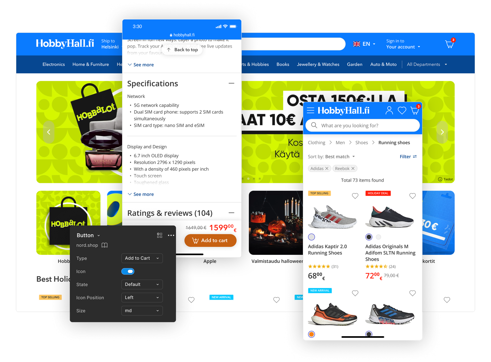
    Using clean and contextual dummy content helps connect to the real world cases and allows the design to be perceived as a functioning product.

    We started presenting the design using clean and contextual dummy content. At first, the head of product was unsure about our new presentation methods because they were used to what came before, but didn't fight us too much. Some of the old habits still prevailed, but over time we started seeing positive changes. With the design looking more like an actual product, it became much easier for the head of product to present it to stakeholders. We saw less and less micromanagement, and more trust in the design process began to appear.

    It usually doesn't take a lot of work to make the mockups more presentable. Sometimes it's enough to switch up the images and copy-paste dummy text from other stores. From my experience, this approach always ends up saving time, because the approval rates are higher, and it reduces the need for excessive revisions.

    Sometimes even if the proposed design solution itself is elegant, if it lacks presentability, it's at risk of being rejected. Usually, the lo-fi presentation only works if it's completely internal or you show it to someone who has a good understanding how it will work.

    What to do when direct user research is not available

    As I mentioned earlier, our team was outsourced, and we were not given direct access to users. The head of product had user access and would occasionally share analytics with us. PHH Group was already dominating the regional market, so performance and UX was not their main concern, and there were already other priorities on the roadmap (which I will get into in the following chapters). Beyond that, it was essentially a “don’t ask, don’t tell” situation.

    The prior design solutions were not random, in fact a lot of them were solid, and based on conventions and standard e-commerce practices. The problem was that the design team didn't have the data to argue with some of the wild suggestions coming from the head of product and lead developer. This resulted in hard compromises, excessive revisions, and half-baked implementations a lot of the time.

    We needed a way to ground our design decisions in UX research. I suggested that my team purchase access to the Baymard Institute, which provides access to a large library of usability research focused on e-commerce.

    I am not sponsored by them or trying to sell you their services, but it's what we used, and it helped us tremendously. I spent countless hours reading through the research libraries to find data that I could use to back my design decisions. But it was worth it because data backed design was trusted much more, and eventually we got to a point when we were encouraged by the head of product to do autonomous research. Of course, not every decision was smooth, but we had a strong backing of the largest usability research repository and made our suggestions with confidence. As a result, we were encouraged to do research and experiment with the design solutions and prototypes.

    Why healthy communication is vital

    The remaining major issue was that practically all communication happened through the Kanban board's task cards. Nothing wrong with it for day-to-day task-related discussions, but without deeper context or real conversation, intentions were often misunderstood and feedback was misinterpreted.

    Text rarely carries the full meaning behind a message: people cannot hear tone of voice, see facial expressions, or ask immediate follow-up questions, all of which reveal important context and help clarify real intentions. The result was visible frustration, growing hostility, and a lack of trust between teams.

    Here's an example:

    A short video call could often have prevented these misunderstandings. Hearing someone's tone of voice, seeing their facial expressions, and being able to ask follow-up questions in real time provides context that text simply cannot. It becomes much easier to understand not only what someone is saying, but why they are saying it. Those small human cues help build empathy, reduce assumptions, and create trust.

    To address this, I involved the Head of Product much more closely in our design process. We introduced weekly meetings to review ongoing work, discuss the roadmap, and reflect on what was and wasn't working. Those conversations transformed the way we collaborated. Misunderstandings became less frequent, trust gradually improved, and the overall dynamic shifted from isolated execution toward genuine collaboration.

    With solid building blocks, our design process became more streamlined each week. Future-proofing and supercharging the design system early equiped us to deal with continuous iterations much better and a lot faster.


    Building a multi-project design system

    We were at the point when PHH Group became a corporate umbrella for a few major stores, and one part of the job was to seamlessly integrate all the stores under one design system. The prior design system was undocumented, and the source of truth was mostly freely interpreted. The devs from time to time coded their own exotic elements and used them as needed. This creaded vast amount of inconsistencies throughout the product.

    The quest for source of truth

    The prior design system was undocumented, and the source of truth was mostly freely interpreted. The devs from time to time coded their own exotic elements and used them as needed. This creaded vast amount of inconsistencies throughout the product. There was a serious problem of no consistency and no single source of truth.

    It wasn't only the text. It was the whole thing: images, elements, titles, etc. Whoever gets to evaluate such presentation feels detached from the real product, and cannot evaluate objectively. Naturally, the head of product was protesting this, and instinctively trying to make it better by pushing their suggestions. You cannot really blame them.

    It's not that time-conuming to switch up product images and find some fitting text that helps whoever is reviewing the design actually feel connection.

    Improving the aesthetics

    It wasn't only the text. It was the whole thing: images, elements, titles, etc. Whoever gets to evaluate such presentation feels detached from the real product, and cannot evaluate objectively. Naturally, the head of product was protesting this, and instinctively trying to make it better by pushing their suggestions. You cannot really blame them.

    It's not that time-conuming to switch up product images and find some fitting text that helps whoever is reviewing the design actually feel connection.

    It wasn't only the text. It was the whole thing: images, elements, titles, etc. Whoever gets to evaluate such presentation feels detached from the real product, and cannot evaluate objectively. Naturally, the head of product was protesting this, and instinctively trying to make it better by pushing their suggestions. You cannot really blame them.

    It's not that time-conuming to switch up product images and find some fitting text that helps whoever is reviewing the design actually feel connection.

    White labeling

    It wasn't only the text. It was the whole thing: images, elements, titles, etc. Whoever gets to evaluate such presentation feels detached from the real product, and cannot evaluate objectively. Naturally, the head of product was protesting this, and instinctively trying to make it better by pushing their suggestions. You cannot really blame them.

    It's not that time-conuming to switch up product images and find some fitting text that helps whoever is reviewing the design actually feel connection.


    Lets work together

    If you're looking for help with your digital product or just want to say hello, drop me an email at and I will get back to you as soon as I can!

  • Follow me:
  • © 2026 Paulopazo
  • +370 671 05725
  • hello@paulopazo.com
  • medium